Most people associate the word NOVA with the bright and beautiful cosmic light in the sky that captures their attention. The NOVA design exhibition was exactly that.
The NOVA exhibition opened April 18 in the Vachon Gallery (Fine Arts Building) and will remain open until May 8. The exhibit is open from 8:30 a.m. to 4:30 p.m. on weekdays.
The exhibition showcases a stunning collection of student designs, each boasting a unique style that is sure to captivate the viewers’ interest. From the mystical allure of tarot cards to the futuristic appeal of sci-fi-inspired designs, the exhibition presents a diverse range of aesthetics that are a treat for the eyes.
NOVA’s Instagram page had a unique marketing approach leading to the opening of the exhibit. The page posted a seven-day countdown to the opening. and included each of the exhibit team members and their roles.
The name “NOVA” was not chosen on a whim, as proven by the reasoning provided by the NOVA team on their website.
“While coming up with a theme that represented us as a cohort, we first landed on the idea of a constellation, with each of us as unique, individual stars unified. This evolved into ‘NOVA,’ symbolizing us as new stars in the professional design world. Like a nova’s light suddenly brightens, we wanted to highlight the best of our work in the Design program.”
While Seattle U Educator and Artist Lucas Boyle has acted as a faculty advisor to students throughout the project, the exhibit also offered students a professional development opportunity, allowing many of them to help with the production of the exhibition itself.
Before showcasing their work, the designers were asked to go through the process of identity branding. Obie Loyola, a third-year design major, explained this was a way to help bring each designer’s style to light.
“We had to make a style guide for it, a cover letter and then the envelope, like an example application. Like a hive of the application itself, that was really cool,” Loyola said.
Loyola’s work is inspired by the “Percy Jackson” book series and Greek mythology.
Amadeus Eckart, a fourth-year graphic designer, discussed the inspiration for his design. His favorite work is making infographics, which require each designer to come up with a real-world topic. His topic was the implementation of AI and sci-fi in space exploration. Eckart shared where his inspiration for sci-fi stemmed from.
“I’ve always loved sci-fi and fantasy growing up, just reading books and comics. I think it’s interesting going into that world,” Eckart said. “It’s not always real. But I think sci-fi has the element of real life. So I wanted to turn that into something that I can be inspired by and actually put onto paper and just translate that into my work.”
Another task that each student had to work on for a portion of the exhibition was a package design. Rowan Hatch, a fourth-year design major, talked about her package design. The design was fashioned using shampoo and conditioner bottles, which Hatch described as “like a scratch and sniff.” The bottle has “smell me” so people can smell the product before buying it.
Hatch talked about her synesthesia, which she believes helps with her designs. Like her other works, the shampoo conditioner design has a lot of color. The all-white shampoo bottle has a rainbow in the middle where the buyer or viewer can smell it before they buy it.
Her synesthesia inspires this colorful rainbow theme. Hatch describes how her synesthesia works for her.
“Let’s say, days of the week, and numbers and letters with color, they each have a color, and same with music. So in my head, it’s like Monday’s correlated with red, Tuesday’s yellow, and Wednesday’s is this. So that’s what synesthesia is. And that kind of helps me design in a way.”
Other designers also shared more intimate and personal experiences in their designs for inspiration. Joie Agoo, a fourth-year design major, worked on four pieces, two of which were called “Mixed” and “The Hidden Price of Paradise: How Over-Tourism has Negatively Affected the Hawaiian Islands.” These were her favorites. Agoo talked about how she loved both of those designs because of how much they related to her.
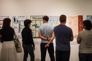
“I entitled Mixed as my favorite because it was personal to me, and about my experience being mixed. I think it really pushed me to go out of my normal creative bounds and try something new and experiment with different creative paths, even though the restrictions were really limited, like you had to follow each one. Each one had its own specific guideline, but I liked how it turned out overall,” Agoo said.
NOVA’s grand opening received positive feedback from both Seattle U students and other design students. Marianne Villamil, a third-year design major, expressed her eagerness to finally visit the exhibition after consistently monitoring the project on Instagram and Discord.
“So I got to see everything behind the scenes, on my Discord, just like stalking them practically. But then I got to see it live in action, which, I think was really interesting,” Villamil said.
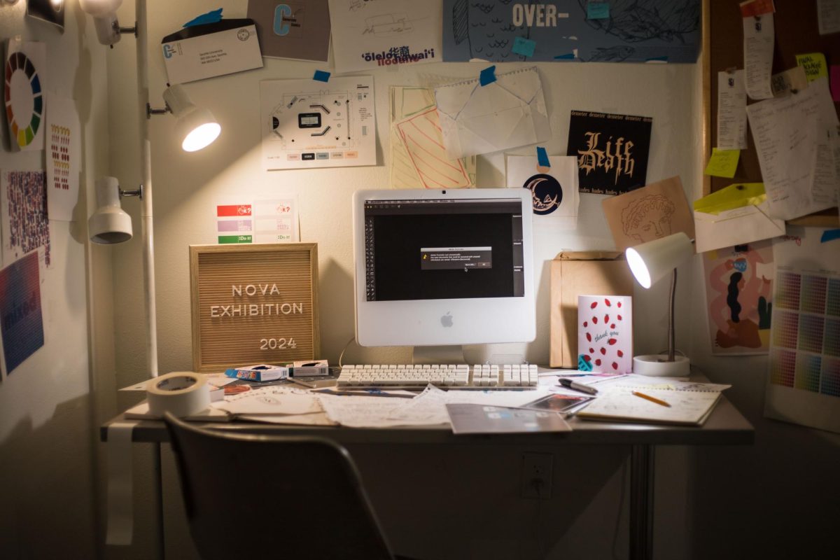
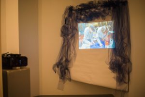
Villamil’s favorite design, which she related to most as a designer, was the “The Draft Room,” a piece located in the corner of the exhibit. This art piece recreated what a designer’s room looks like after working on so many projects. The room is scattered with unfinished art pieces, papers on the floor and a makeshift PC with the Adobe logo showing that it has been scratched—difficulties she’s experienced as a designer.
“There’s a little paper, and it looks like a screen. It says, like Adobe unexpectedly crashed, and, I relate to that so much cause then your whole work is gone,” Villamil said.
The opening day saw a significant community turnout. Similarly, many of the designers have felt a connection and sense of community with the other designers who worked on the project. Loyola shared his experience with how it felt working with the team.
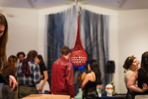
“Normally, I leave really early because I commute here [to Seattle U]. So, after class is done, I just go home and work, and then come in next day, critiques and everything I would normally do, but I never felt that I hadn’t. I wish I had more time to hang out with everyone but I think that working on the exhibition gave me that little outlet to hang out with everyone and really feel part of it,” Loyola said.
On the other hand, some members felt some of the pressure of the setting up for the exhibit, such as Hatch, and the creative compromises that came with the process.
“ I feel like most of us kind of agreed, but we kind of had to just settle for some things we didn’t like, but then we actually got into the team-leading stuff and I think it worked pretty well,” Hatch said.
At the end of setting up for the exhibit’s opening, the team seemed satisfied with the work they presented. The work paid off, and everyone got to show off their designs in a bright, beautiful NOVA.
“I’m really proud of our cohort. I think we work really well. I think in the beginning, there were definitely worries,” Eckart said. “And then, as we went along, I think I really saw how our individual styles waved together to make our NOVA exhibition. That’s kind of what all the NOVA theme is about.”
NOVA is a testament to the power of collaboration and creativity, and it promises to leave a lasting impression on everyone who visits the exhibition.


